

THE SHORT ANSWER
A B2B landing page should make a specific decision easier. It needs to match the visitor’s starting point, answer important questions and offer an understandable next step. Form volume alone does not show whether the page performs that job well.
For the broader picture of how target customers, channels and sales handoffs work together, read the pillar guide B2B demand generation: from attention to qualified pipeline.
Define the entry point and page objective
Record where visitors come from and what was promised there. An advertisement about a specific integration needs a different introduction from a general expert article. Then define one primary page task: requesting a demonstration, receiving a guide or clarifying suitability. Several equally prominent objectives make navigation and evaluation harder. That does not mean every visitor must convert immediately. A useful alternative for earlier research can help, provided the hierarchy remains clear. The main action should not disappear among competing offers. A documented objective also gives reviewers a basis for judging whether each section helps the intended decision or merely fills space.
Make the first screen specific
State the audience, problem and product contribution in understandable language. “More growth through innovation” offers little reason to stay. An illustrative alternative would explain how recruiting teams share a clear view of applicants and hiring stages. Add a genuine product view or relevant visual when it improves understanding. A personal photograph can support trust but should not displace essential orientation. Check smaller screens carefully: headline, image crop and next action must work together. The first screen begins the explanation; it does not need to compress every argument into an overcrowded area that becomes difficult to read or navigate.
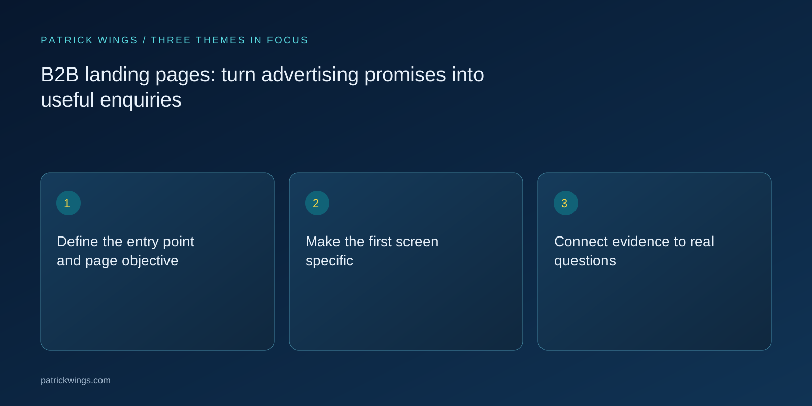
Connect evidence to real questions
Use genuine customer logos and explainable case examples that you have permission to publish. A logo demonstrates a relationship rather than proving a specific service or outcome. Explain the support provided where publication is permitted. Add product evidence, workflows and clear boundaries of use. An IT audience may need integration and operating details more than a long wall of benefits. A business stakeholder may benefit from an understandable process comparison. Results claims require a verifiable basis. Keep illustrative scenarios visibly labelled so an example cannot accidentally appear to be a real customer reference or a promised commercial result. Explore this further in the guide Acquiring SaaS signups: plan freemium growth through activation.
Design forms around the next step
Request information necessary for the promised offer and its proper handling. A technical discovery conversation may need context; an educational download does not automatically justify the same depth. Explain unfamiliar labels and show understandable validation messages beside the relevant field. Check keyboard operation, mobile entry and the handling of existing contacts. After submission, make the outcome clear: download, confirmation, personal response or scheduling. Simulate the complete process using a controlled record. A well-designed page loses its purpose when submission fails or the handover never reaches the person responsible for responding. Treat confirmation and delivery as part of the page experience.

Test business hypotheses rather than decoration
Begin with a concrete assumption, such as whether an integration diagram resolves a recurring concern. Define the expected effect and an appropriate measure. A button colour test does not answer that question. With limited traffic, structured qualitative evaluation may be more useful than prematurely interpreting an A/B test as statistically conclusive. Speak to users, observe misunderstandings and inspect real enquiries. Change important elements separately where practical if learning matters. Also account for visitor mix: a higher overall conversion rate can result from different traffic even when the page has not improved for any comparable group of visitors.
Feed contact quality back into the page
Connect submissions with reachable people, confirmed suitability and later conversations. If a page creates many wrong expectations, clearer positioning may help more than removing another field. Review common questions and rejection reasons with sales. Add information where it helps a decision rather than simply lengthening the page. Recheck loading behaviour, image sizes, links and accessibility after material changes. A landing page is a maintained commercial instrument. It should help suitable prospective customers while communicating the limits of the offer fairly to people in unsuitable situations. Better qualification can be a useful outcome even when it reduces the raw number of forms submitted. Explore this further in the guide LinkedIn Ads for B2B: from relevant audiences to useful conversations.
INTERACTIVE / FROM READING TO ACTION
Three checkpoints for your implementation
Choose a checkpoint and track your reading progress. Checks are neither saved nor sent and do not score your business.
CHECKPOINT 01
Connect evidence to real questions
Use genuine customer logos and explainable case examples that you have permission to publish.
Explore in the article ↗CHECKPOINT 02
Design forms around the next step
Request information necessary for the promised offer and its proper handling.
Explore in the article ↗CHECKPOINT 03
Test business hypotheses rather than decoration
Begin with a concrete assumption, such as whether an integration diagram resolves a recurring concern.
Explore in the article ↗Frequently asked questions
Does every advertisement need its own page?
Not necessarily. A separate page makes sense when intent, audience or offer requires materially different explanation.
Are fewer fields always better?
Reducing effort can help, but the necessary information and subsequent contact quality matter too.
What should we test with limited traffic?
Review comprehension, technical operation and real contact journeys. Small datasets rarely justify strong claims about statistical winners.
How can I put “Define the entry point and page objective” into practice?
Record where visitors come from and what was promised there. An advertisement about a specific integration needs a different introduction from a general expert article. Then define one primary page task: requesting a demonstration, receiving a guide or clarifying suitability.
What matters when working on “Make the first screen specific”?
State the audience, problem and product contribution in understandable language. “More growth through innovation” offers little reason to stay. An illustrative alternative would explain how recruiting teams share a clear view of applicants and hiring stages.